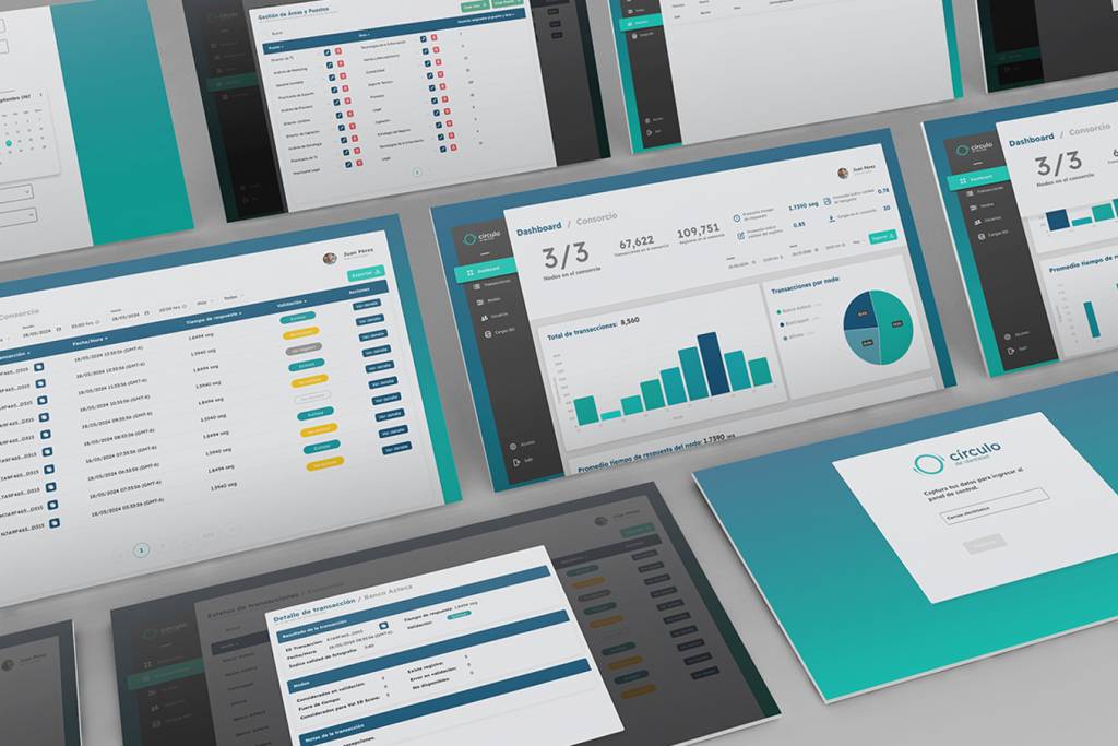
System Dashboard
In a context where the security of bank customer information is critical in Mexico, and there are no non-governmental entities that can validate bank customer information with official sources, DICIO ALLIANCE emerges as a B2B SaaS product based on blockchain and artificial intelligence. The challenge was to design the product administration dashboard, allowing the consortium and banks to visually and intuitively monitor and manage the status of the entire system, individual nodes, and all transactions.
My role was to lead the end-to-end design process for this tool, from research to product validation in production. Along with my design team, the commercial and marketing teams, we researched the market to validate similar product offerings in the industry. We worked directly with three of the largest banks in Mexico as strategic partners to analyze, define, and architect the features that would truly add value to the product.
I facilitated all the design thinking workshops, led user research and information architecture, planned and defined the design sprints, established the parameters for the design system, supervised and analyzed the results of usability tests, and worked hand in hand with the development and QA teams to ensure the consistency and functionality of all product components before their release. Finally, we collected and analyzed user data from the live product using tools like UXCAM, MAZE, and Hotjar to make decisions for product improvement and optimization.
Our Goals
Transparency and Trust
To build a system that provides banks with a high degree of confidence and transparency regarding their clients’ information validation, reducing uncertainty and risk. The dashboard had to clearly visualize the transaction status and data traceability validated with official entities.
Efficiency in Administration
To enable banks and the consortium to manage the system efficiently. This included visualizing key metrics on system status, node performance, and transaction volume, as well as facilitating node management.
Usability and Adoption
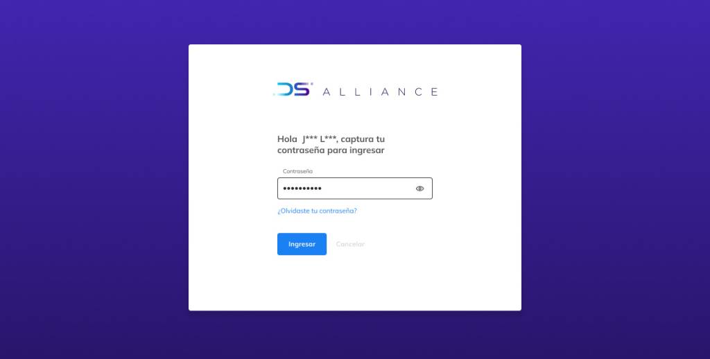
Despite the underlying complexity of the technology, the dashboard had to be intuitive and easy to use for administrators. The goal was for users to adopt the tool quickly without the need for extensive training. This was to be achieved by designing a logical information architecture and clear navigation, and by using data visualizations that simplified the interpretation of complex data.
Research & Explorations
For this project, our research was based on a holistic approach. Together with the marketing and commercial teams, we analyzed the offerings of similar products to identify market gaps. The main finding was the lack of an independent entity that could validate information with official sources.
We conducted interviews and analysis with key users (Directors of Operations, Security Administrators, Risk Managers, etc.) to understand their workflows, pain points, and specific needs. The most important findings were:
Lack of centralized visibility
There was no clear way to see the status of transactions and validations in real-time.
Need for transparency
Users not only needed to know if a transaction was successful, but also why and how it was validated, in order to audit the process.
The most frequently repeated phrase in the interviews was
“I need a way to see the status of all validation transactions at a glance, and be able to click on one to see the ‘complete story’ behind it.”
This led us to the conclusion that the dashboard’s primary goal was to build a layer of trust that would transform technical complexity into a transparent user experience.
Dashboard Design
The dashboard design for DICIO ALLIANCE directly applies our design goals and research findings:
Transparency and Trust
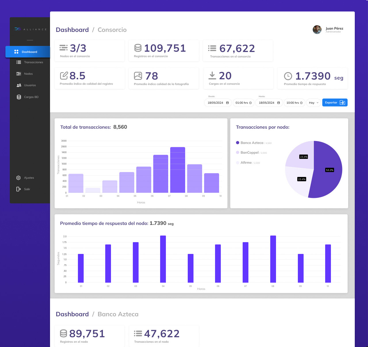
The key performance indicators (KPIs) at the top, such as “Registros en el consorcio” (Consortium Records) and “Transacciones” (Transactions), allow users to see the overall system status at a glance, which is essential for building confidence. The “Promedio índice de calidad del registro” (Average Record Quality Index) metric uses a clear number to quantify reliability, directly addressing the goal of building trust.
Efficiency in Administration
The design facilitates efficient management by providing two main views: one for the Consortium, which offers a system-wide overview, and one for each Bank, which focuses on data specific to its own node’s performance.
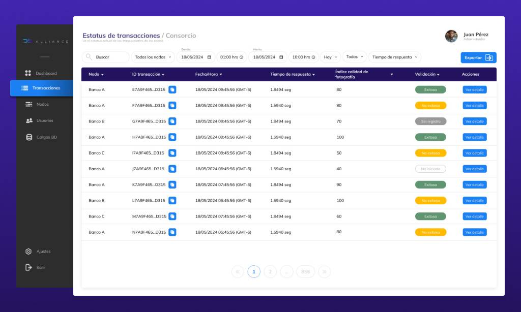
Auditing Capability
The inclusion of “Exportar” (Export) buttons in each data section is a crucial element for efficiency. These buttons allow specialized users to generate complex reports containing the system’s real and detailed data volume for audits or disputes.
Usability and Adoption
The design focuses on usability by presenting a clean interface and a clear visual hierarchy.
Intuitive Navigation
The side navigation bar is simple and easy to understand.
Data Filters
The inclusion of date selectors and export options allows users to customize their view and quickly access the information they need, avoiding unnecessary complexity.
UI Design Process
The UI design process was rigorous and collaborative, ensuring that every component was functional, aesthetically pleasing, and scalable for the long term.
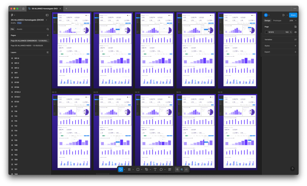
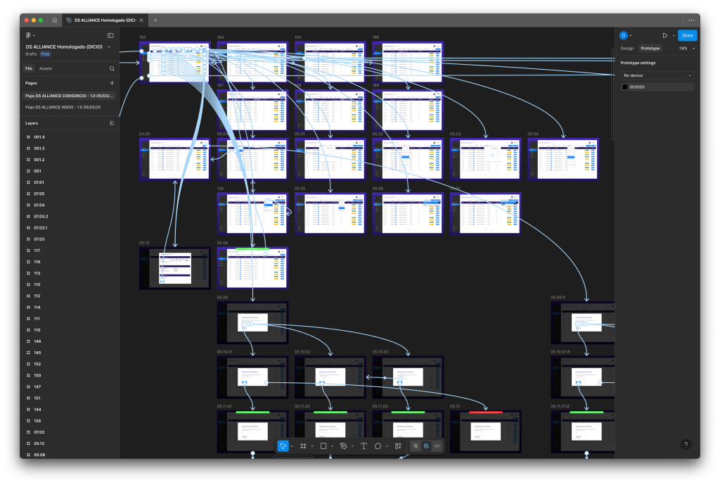
Wireframes and Prototyping
Initially, we focused on wireframes and low-fidelity prototypes to define the information architecture and user flows. This allowed us to validate the tool’s functionality and usability without visual distractions before moving on to the design phase.
Mockups and Iteration
Once the flows were validated, we created high-fidelity mockups that reflected the brand’s goals and aesthetics. This process was highly iterative, with constant usability testing sessions with our strategic partners to refine each component and ensure the interface was intuitive and efficient.
Design System Construction and Maintenance
To ensure consistency and scalability, we built a robust design system.
This system was materialized in Figma, where components, color palettes, and typography were standardized.
We worked hand in hand with the development team to build the design modules in React Bits, ensuring that the components in the design tool were identical to the ones in the code, minimizing technical debt and guaranteeing consistency.
Next Steps & Learnings
The initial version of the dashboard has been well-received, and the team is already focused on bigger challenges to position the product as a leader in the sector. Some of the key features for the next iterations include:
Intelligence and Predictive Detection
- Fraud Detection Module: To develop predictive functionalities that, using transaction data, blacklists, and internal fraud prevention tools, can proactively alert banks about potential risk patterns, rather than just reacting to incidents.
- Predictive System Analysis: To project the future performance of nodes and the system as a whole, helping administrators plan and prevent scalability issues.
- Active Alerts with AI: To implement a proactive alert system that, through artificial intelligence, identifies and notifies users about anomalies or critical situations requiring their immediate attention, which might be difficult to detect manually.
Data Expansion and Management
- Multi-Entity Support: To expand the dashboard to integrate more banking and financial entities fluidly.
- AI-Assisted Billing Module: To design a billing module that uses artificial intelligence to automate and simplify the process of reconciling charges, allowing for more efficient billing.
The experience of leading this project from start to finish has provided valuable lessons for the team and for the role of design in the organization:
The value of research and collaboration is indisputable. Investing time in research from the beginning ensures that the product solves real problems.
The role of design is not just to create interfaces, but to facilitate smarter product decisions.
Humility in the process is fundamental. The best ideas can come from any team member, and the common goal must always be the best outcome for the end-user.
Throughout the development of the DICIO ALLIANCE dashboard, the main focus was to transform the complexity of a data validation system into a transparent and reliable experience. Through a user-centered design process and close collaboration with strategic partners, we achieved not only a functional product but a tool that empowers banks to make crucial decisions with total security.