Biometric Onboarding
In a saturated market of onboarding platforms, the challenge was to redesign Grupo Salinas’ product offerings for its most important client: Banco Azteca. The objective was clear: to create a solution that would stand out and provide tangible value in a sector full of competitors.
In collaboration with DICIO AI as a technology partner, my role was to lead the definition, design, and innovation of this new product suite. My previous experience leading the innovation of onboarding platforms at NA-AT TECH, a market pioneer in Mexico and Latin America, was a key factor. This background gave me a deep perspective on the recurring pain points of users and the functional gaps in the market. Thanks to this knowledge, my team and I were able to propose strategic paths that truly solved problems and improved the end-user experience.
Our Goals
For this redesign to have a real impact, we defined a series of clear and measurable goals, focused on both the user experience and the business objectives.
Radical Efficiency
Market analysis showed us that existing onboarding processes, with an average duration of up to 10 minutes, were one of the main causes of user drop-off. Our primary goal was to reduce the sign-up time to a maximum of 3 minutes. This involved not only optimizing the flow but also reimagining each step to eliminate friction and automate processes, transforming a tedious task into a fast and fluid experience.
Error-Proof Design
Errors during onboarding not only frustrate the user but also generate distrust and increase operational costs. Our objective was to reduce the error rate to a minimum through a guided and intuitive design that used microcopy and a conversational interface. We focused on creating an experience that anticipated user needs, offered clear, precise, and minimal instructions, and provided real-time validations to ensure success from the first attempt.
Perceived Simplicity
A process can be technically complex, but it doesn’t have to feel that way to the user. We sought to drastically reduce the perceived cognitive load by eliminating unnecessary steps, automating information capture with OCR technology, and breaking down identity validation into small, digestible steps. The goal was for the user to never have to stop and think about what to do next; we transformed complexity into simplicity.
Maximize Conversion
All the previous goals converge on a primary business objective: to maximize the rate of users who successfully complete the onboarding process. By creating a faster, simpler, and more reliable process, we aimed to significantly increase conversion, translating UX improvements directly into growth for Banco Azteca and consolidating the product suite as the market-leading solution.
Universal Accessibility
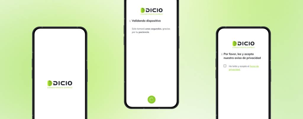
A key strategic goal was to eliminate the most common barrier to entry: the need to install a native application. To ensure the platform was accessible from any device, the decision was made to center the experience on a Progressive Web App (PWA), compatible with most browsers and operating systems on the market. Although mobile applications were developed as an option, the PWA served as the system’s core platform. This strategy not only reduced friction for the user but also resulted in exceptional adoption, massively expanding the product’s reach.
Research and Exploration
Unlike a project starting from scratch, our research was based on an exhaustive analysis of existing data. Having access to the analytics of products in production, combined with my previous experience in the sector, allowed us to diagnose with great precision the pain points for both end-users and financial institutions.
This approach enabled us to move quickly from data to actionable insights.
End-User Pain Points
Users don’t abandon processes without reason; they do so because of recurring and predictable frustrations. We identified three main causes:
- Long and Cumbersome Processes: The main complaint was the duration and effort required. Users perceive manual data entry as a tedious task and an unnecessary obstacle, leading to a high drop-off rate before completing the flow.
- Friction with Capture Technology: We found that the interaction with biometric and document capture modules was a critical point of failure. Ambiguous instructions about lighting, angle, or the position of the face and IDs resulted in multiple failed attempts, generating distrust in the technology and deep frustration.
- Uncertainty and Lack of Feedback: Users often operate “blindly,” not knowing if they are performing the steps correctly until an error occurs. This lack of real-time feedback turns the process into a “black box” that generates anxiety and reduces user confidence.
Business Pain Points
User problems translate directly into costs and risks for the institution.
- Operational Costs due to Inefficiency: Every failed user attempt represents a tangible cost. Multiple executions of validation services (OCR, biometrics, etc.) by a single user multiply expenses. Furthermore, low-quality captures often require manual review, increasing personnel costs and slowing down operations.
- Security and Compliance Risks: Low-fidelity captures of documents or faces are not just a UX problem but a security risk. They increase vulnerability to fraud attempts and can compromise compliance with KYC (Know Your Customer) regulations, exposing the bank to potential penalties.
This precise diagnosis, which directly connects user frustration with business risk and cost, was the foundation upon which we defined our design goals and product strategy.
Application in the Onboarding Process Design
The research diagnosis was the cornerstone of our design strategy. Every decision and every component was created to directly address the identified pain points and meet our goals of efficiency, simplicity, and conversion.
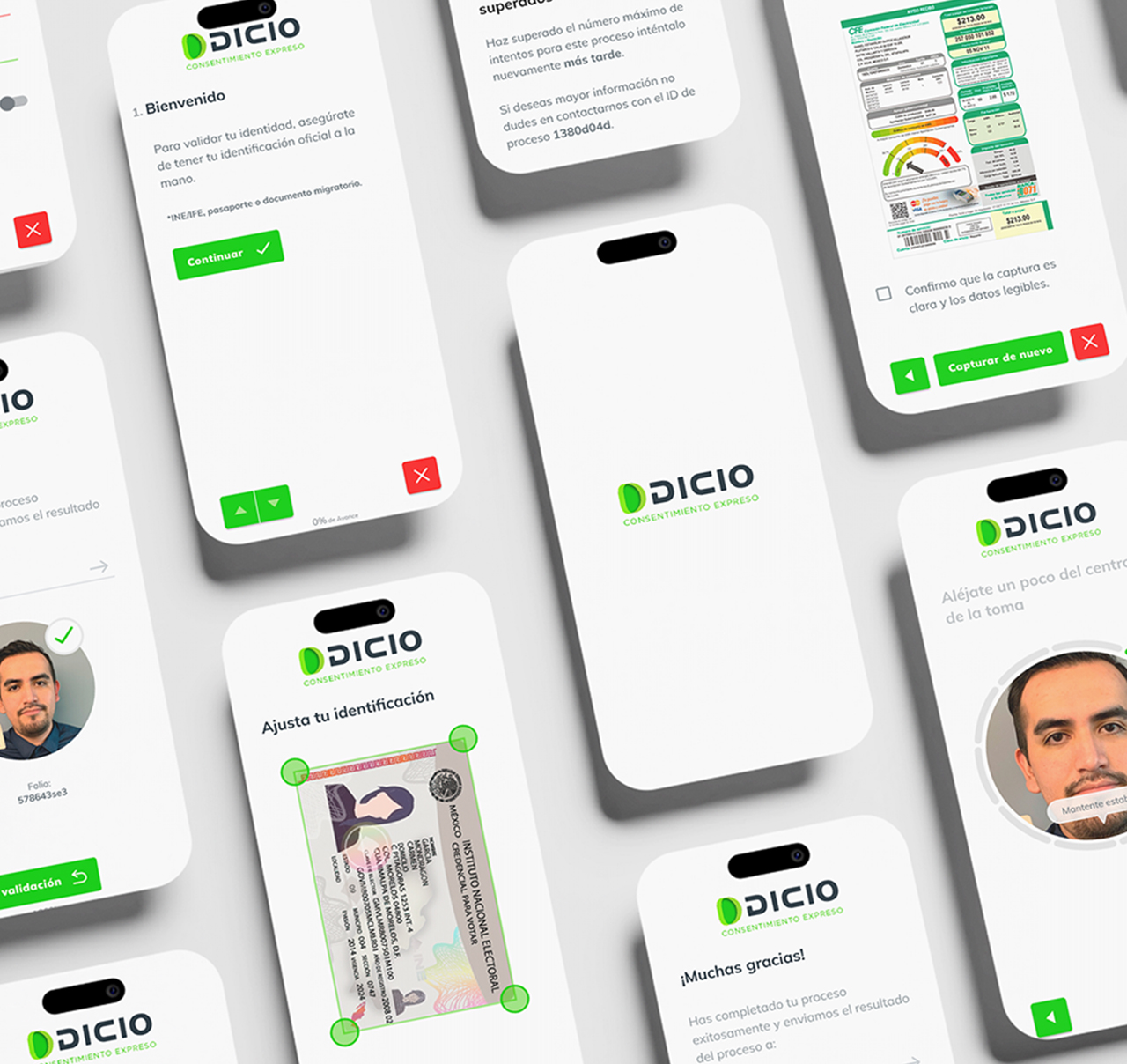
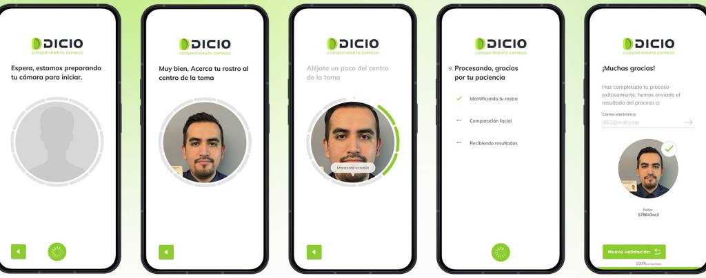
A Conversational Flow Instead of Forms
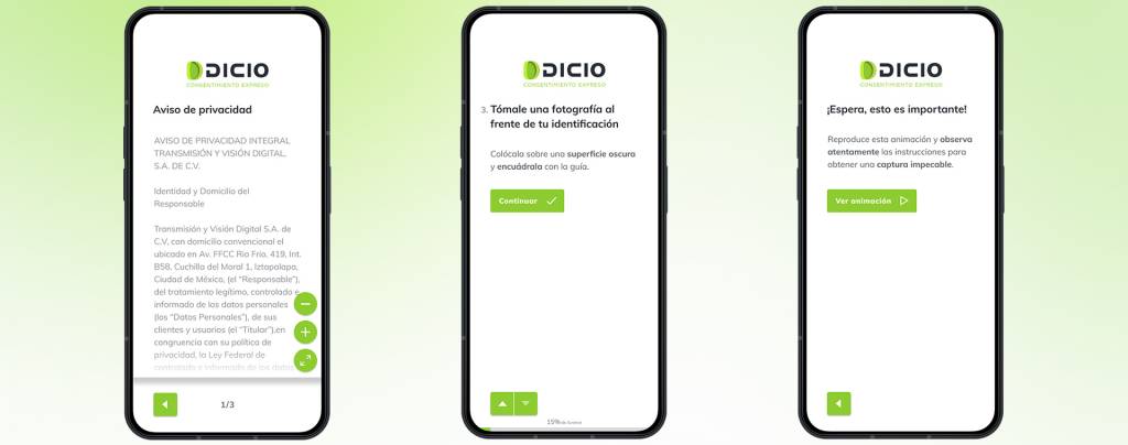
To combat uncertainty and cognitive load, we abandoned the traditional form paradigm and designed a conversational interface. Instead of presenting the user with a screen full of fields to fill out, the system guides them step-by-step, requesting one piece of information at a time. Each successful step is confirmed with microcopy and micro-interactions, giving the user a constant sense of progress and security. This drastically reduces the possibility of error and transforms an intimidating task into a simple, guided dialogue.
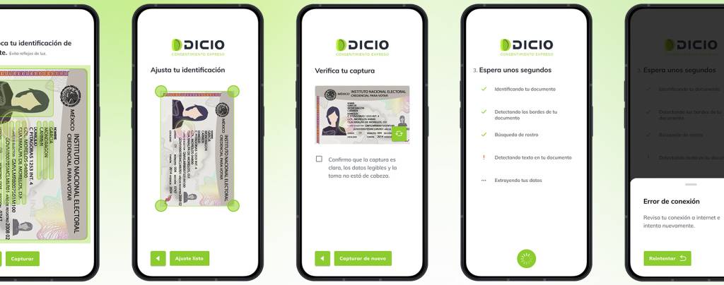
Smart Capture Modules with Real-Time Guidance
The biggest source of frustration was failed attempts at capturing documents and selfies. To solve this, we designed smart capture modules that analyze image quality in real-time, before the user submits it. Through dynamic on-screen guides (“Move closer,” “Find a brighter place,” “Hold the document steady”), the user receives precise and actionable instructions to succeed on the first try. This eliminates guesswork and reduces friction with the technology.
Automation as a Priority
To meet the goal of radical efficiency and eliminate tedious processes, we inverted the workflow. Instead of asking the user to manually transcribe data from their ID, the first action is to take a picture of it. Optical Character Recognition (OCR) technology extracts and auto-fills the information in seconds. Thus, the user’s role changes from “data entry clerk” to “supervisor”: their task is no longer to type, but simply to verify that the extracted data is correct, reducing time and effort to a fraction of what it was.
Design Oriented Towards Conversion and Business Efficiency
Each of these improvements in the user experience has a direct impact on business objectives. By reducing errors and retries, we minimize operational costs associated with unnecessary API calls and costly manual reviews. A clearer, faster, and more reliable flow not only maximizes the conversion rate of new customers but also ensures the receipt of high-quality data and documents from the outset, strengthening the institution’s security and regulatory compliance (KYC).
Visual Design (UI) Process
Once the flow architecture and interaction logic were validated, our next step was to translate that strategy into a visually intuitive, secure, and efficient interface. The process was methodical and collaborative, ensuring that each visual element served a functional purpose and reinforced the project’s objectives.
Functional Foundations: Wireframing and Prototyping
Before applying any color or style, we focused on the fundamental structure through wireframes and low-fidelity prototypes. This stage was crucial for defining and validating the skeleton of the experience:
- We validated the conversational flow, ensuring the “one question at a time” sequence was logical and fluid.
- We defined the information architecture on each screen, ensuring that only essential elements were displayed to avoid cognitive overload.
- We iterated quickly on the layout of the capture modules, testing different approaches for the real-time guides.
This approach allowed us to solve the most complex usability problems at an early stage, without the distractions of aesthetic design.
High-Fidelity Design
With the structure validated, we moved on to high-fidelity mockups. The visual challenge was twofold: the interface needed to feel modern and innovative, as expected from a cutting-edge tech solution, but at the same time solid and secure, to build the trust a banking institution requires.
- Clear Visual Hierarchy: We used size, color, and white space to guide the user’s attention to the main action of each step, eliminating any ambiguity.
- Typography and Legibility: We selected a clean and highly legible typeface family to ensure that instructions and microcopy were easy to consume, even in low light or on small screens.
- Micro-interactions: We designed subtle animations and transitions that provided instant feedback, confirming user actions and making the experience feel responsive and professional.
Scalability and Consistency
To ensure consistency across the entire product and accelerate future development, we built a robust Design System. This was not just a style guide, but a single source of truth for designers and developers.
- Component Library in Figma: We centralized all interface elements (buttons, text fields, modals, etc.) as reusable components, standardizing their appearance and behavior.
Collaboration with Development: We worked closely with the engineering team to ensure that the Figma component library had an exact mirror in their code (React). This synchronization eliminated inconsistencies, reduced technical debt, and allowed the team to build new features at a much faster pace, with the confidence that the user experience would remain intact.
Next Steps and Learnings
The initial launch of the onboarding suite was a success, validating our central hypothesis: a design focused on efficiency and simplicity directly impacts conversion. Beyond the metrics, we managed to build trust in the design team’s decisions, proving that a data-driven approach can challenge market conventions and produce superior results.
The initial questioning about the viability of a purely conversational interface has transformed into a key question for the future: “How far can we take this model?”
Key Learnings and Immediate Improvements
- Process Visibility Remains Crucial: One of our most debated decisions was to omit an explicit progress indicator. The hypothesis, based on the drastic reduction in steps, was that it wouldn’t be necessary. However, post-launch feedback showed us that even in a short flow, users gain confidence from knowing how many steps are left. Our first next step is to design and integrate a minimalist progress indicator that eliminates this uncertainty without adding visual clutter, thereby improving the user’s perception of control.
- The Power of Data to Drive Innovation: This project reaffirmed that the most effective innovation is born from an accurate diagnosis. By basing our decisions on analytics and a deep understanding of pain points, we were able to defend a radically different approach. The lesson is clear: the role of design is not just aesthetic, but strategic, facilitating smarter product decisions that translate into business wins.
- Web-First Accessibility Drives Adoption: The decision to build on a PWA as the core platform, instead of forcing an app download, was a determining factor in the success of adoption. This approach validated that removing barriers to access is as important as optimizing the flow itself, and it became a key competitive advantage.
The Next Frontier
Our long-term vision is to evolve from a guided process to an intelligent and proactive one.
Integration of an Artificial Intelligence Agent: The next big leap will be to explore the integration of an AI agent that personalizes the experience in real-time. Instead of a one-size-fits-all flow, the AI could adapt the steps according to the user’s profile, pre-identify inconsistencies in the data, or even modify the tone of the conversation to be more effective. This represents not only a fascinating technological advancement but the next level of efficiency and personalization in identity validation.
In summary, the onboarding redesign not only solved functional problems but also established a new foundation upon which to build the future of digital identity at Grupo Salinas, proving that the best user experience is always the most profitable path.